CRITICAL INTRODUCTION
TO VOLUME 1 OF THE DIAL (1889)
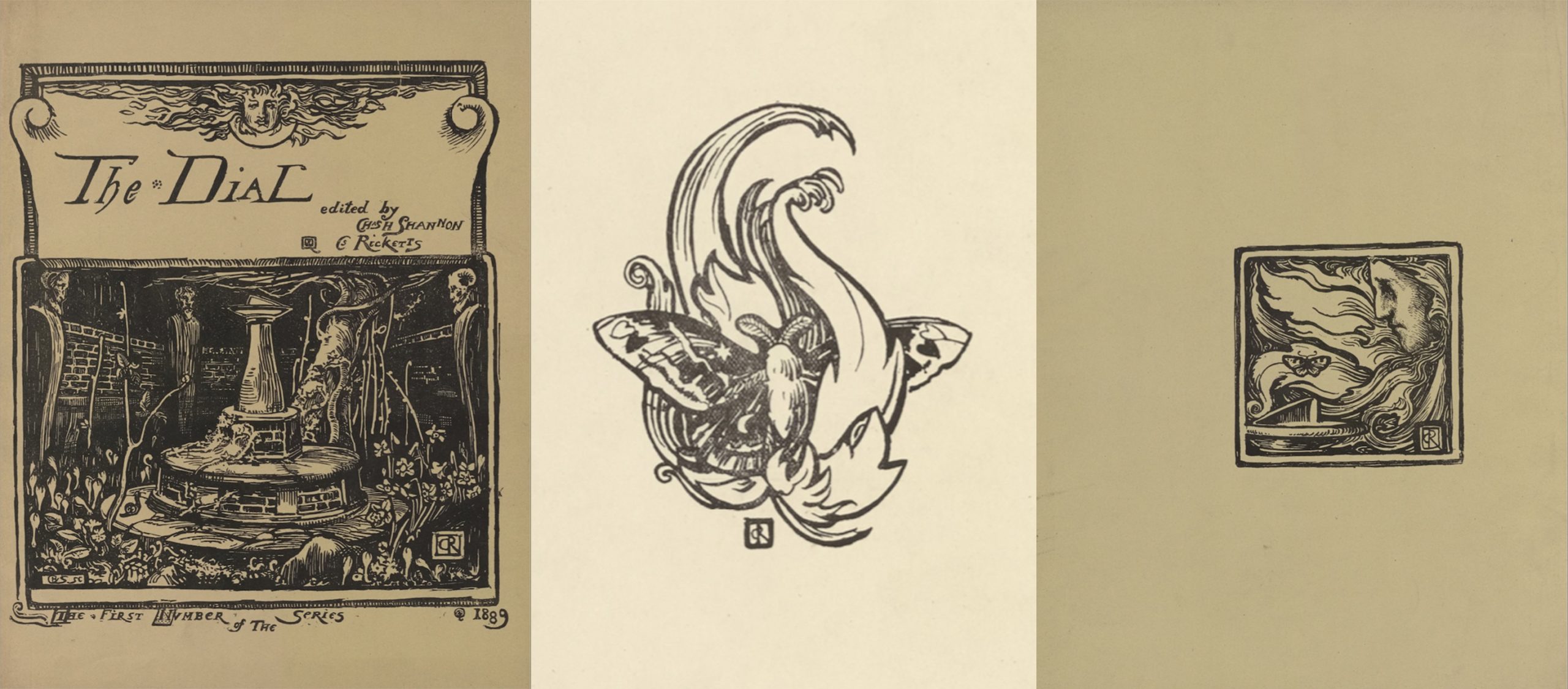
The unsigned “Apology” located on the final page of the first Dial brought out by Charles Ricketts (1866-1931) and Charles Shannon (1863-1937) in August 1889 outlined the editorial defense (apologia) for the eccentric publication: “The sole aim of this magazine is to gain sympathy with its views” (36). The views expressed in this first number were those of a very limited group indeed: four young men based in central London. In addition to co-editors Ricketts and Shannon, who between them produced most of the magazine’s contents, Reginald Savage contributed a single artwork and a series of brief “Notes” on current exhibitions and John Gray provided a fairy tale and a critical essay. Like its Pre-Raphaelite predecessor the Germ (1850), the Dial sought to set the visual and verbal arts in dialogue with each other. Artists illustrated the literary efforts of their colleagues, Ricketts designed textual ornaments for specific pieces of writing (fig. 1), and the magazine as whole engaged with ideas of design. While the Dial might have shared the Germ’s subtitle, “Thoughts Towards Nature in Art and Literature,” its approach is more fantastic, mythical, and decorative. Indeed, the magazine’s artistic vision extends beyond the English Pre-Raphaelites to include the art and literature of the Continent, particularly that of France.
The “Apology” concludes with the acknowledgement that “we are out of date in our belief that the artist’s conscientiousness cannot be controlled by the paying public” (36). With this opening salvo, the Dial signals its view of itself as a work of art controlled by artistic vision, rather than a trade commodity regulated by commercial considerations. This high-minded commitment to art was carried out in the magazine’s eschewal of all advertising material. The little magazines that followed typically included some form of advertisement in their back pages. In the Yellow Book (1894-97) and the Savoy (1896) the advertising supplements were made up of publishers’ lists and related industries, such as engraving firms; in the Green Sheaf (1903-4) and the Venture (1903-5), the advertising also promoted the artistic and commercial endeavours of the magazine’s contributors. Without the support of a trade publisher or advertisers, the Dial required those in sympathy with its views to pay 7 shillings 6 pence for a quarto of 36 pages of art and letterpress, loosely stitched into brown paper wrappers. This material format gave owners of the magazine maximum flexibility. They could decide if they wanted to have the volume bound, keep it in portfolio form, or even remove some of the artwork for framing.
The first issue of the Dial brought Ricketts and Shannon, then only in their twenties, into contact with Oscar Wilde, who became a frequenter of their home in the Vale and thereafter collaborated with them on his decorated books. With characteristic wit, Wilde advised the editors, “do not bring out a second number, all perfect things should be unique” (Ricketts, Recollections 231). Despite Wilde’s enthusiasm, Ricketts was dissatisfied with the printing of the Dial’s first issue. The coated paper used throughout made the inking of the letterpress difficult to control, resulting in some smudging and graying of the type. Another disappointment was the textual ornaments; reproduced by photomechanical process from Ricketts’s pen designs, they did not harmonize well with the type. In the three years it took to bring out the second issue of the Dial, Ricketts began the laborious process of wood engraving his own designs for the magazine’s textual ornaments. This artisanal commitment to original wood-engraved decorations became the hallmark of the Dial and, later, of Ricketts’s Vale Press.
While the Monster in Ricketts’s fantastic dialogue, “The Cup of Happiness,” complains that “The world is without decorative instincts” (31), the Dial itself was intent on counteracting this modern tendency. Indeed, “decorative instinct” was a key component of the magazine’s editorial policy. Governed by a unifying design, the sequence, arrangement, and selection of the first issue’s contents weave together art, ornament, and letterpress into artful pattern. Inspired by Continental Symbolism, Ricketts worked out elaborate iconographical arrangements that were, as Stephen Calloway points out, meant to be read allegorically (13, 21). Motifs of the sun, flames, flowers, butterflies, and monsters form a pattern from cover to cover, gesturing towards the magazine’s interest in illumination, grotesque and liminal forms, the immortality of art, and the fiery chrysalis of creativity. Completing the circle of design, the ornament on the back cover reworks the iconographic details of the front cover and flyleaf, re-casting the sun with flaming hair presiding over the sundial and incorporating the fully fledged butterfly, risen like a Phoenix from the fire, as an emblem for the constantly metamorphizing, unquenchable, spirit of art (fig. 2).
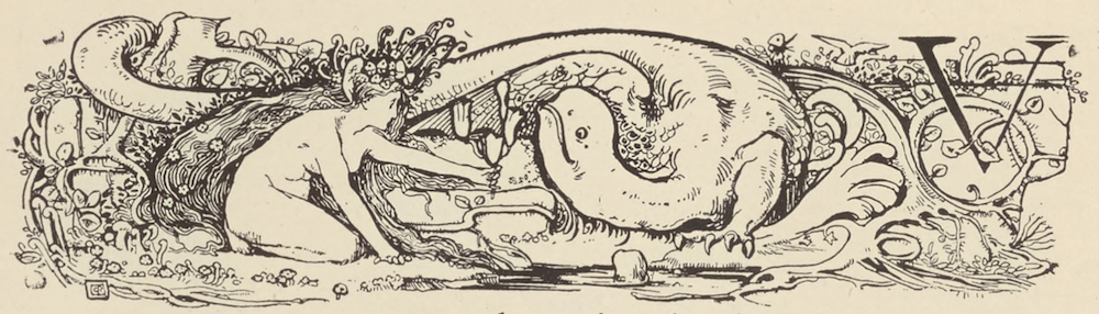
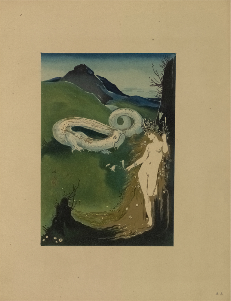
With art, decoration, and design the prominent features of the Dial, it is not surprising that the editors elected to give the magazine’s Art Contents pride of place: the issue opens with a List of Illustrations, but does not itemize its literary contents. The volume’s seven full-page images, moreover, are not paginated, but inserted between the quarto’s signatures at eight-page intervals, marked as AA, AB, AC, and so on. This arrangement means that none of the images are physically proximate to the works they illustrate. The coloured frontispiece designed by Ricketts and executed by the lithographic firm of M. & N. Hanhart is a gorgeous composition in blue, green, and gold (AA; fig. 3). In addition to establishing two key motifs of the issue—the grotesque monster and the naked spirit of Fantasy—the image illustrates John Gray’s fairy tale, “The Great Worm” (14-18). Ricketts also provided an etching for the story (AE), thought by H.C. Marillier to be unique in the artist’s oeuvre (180), as well as a pictorial initial and tailpiece ( see Database of Ornament). Co-editor Shannon’s illustration for Ricketts’s own fantastic tale, “A Glimpse of Heaven” (AF), captures the story’s supernatural vison while also responding visually to the author-artist’s pictorial initial letter representing the dead child (19). Shannon contributed three other images to the issue, making him the magazine’s most prominent artist. Two of these, “The Return of the Prodigal” (AB) and “The Queen of Sheba” (AD), illustrate biblical story, while “Circe the Enchantress,” reproduced in halftone from a watercolour, turns to classical myth. Reginald Savage also takes a spiritual or symbolic story for his subject, “The Miracle of the Roses” (AC), which the magazine presents in a poorly reproduced halftone.
The Athenaeum praised the “real beauty” of Ricketts’s frontispiece and “the cleverness of an initial letter or two,” and noted that “Mr. Shannon has the making of a capital painter in him,” but did not see enough merit in the magazine’s first issue to anticipate a second (Rev. of The Dial, 712). Although panning the Dial as a whole, the Spectator conceded that “we can easily conceive its being adored by a small section of artists and art-lovers who admire beauty in execution—there is no question whatever as to the quality of Mr. Shannon’s work—and do not object to extravagance and even absurdity in style” (“Current Literature” 279-80). While the Magazine of Art was less positive about Shannon’s contributions, its critic singled out Ricketts’s etching for showing “considerable artistic power and some imagination” (“Art in December,” xi). None of the critics had anything positive to say about the Dial’s literary contents, which they found obscure, unintelligible, and over-reaching.
The Dial’s letterpress, however, makes a significant contribution to the overall design and decorative concerns of the first issue and should not be dismissed out of hand. Notably, its experimental short fictions demonstrate both Decadent and Modernist tendencies in the use of language to develop a pattern of sensations, impressions, and motifs, rather than to develop plot or character (Boyiopoulos et al, 21-22). Also important is the magazine’s turn to the art and literature of France to celebrate and showcase a kindred interest in symbol and design. Ricketts’s lead article on French Symbolist painter Puvis de Chavannes (1824-1898) laments the loss of “[i]ndividual rendering in a decorative form, in line or colour” in English art, due to a xenophobic resistance to continental influence (2). The essay seeks to reclaim de Chavannes from the sneer of “mere decorator” (2) and to show the ways in which his work aligns with that of the English Pre-Raphaelites through a common “love of nature” (4). The implication is that Ricketts’s own work in the Dial synthesizes the two. As if to mark this moment of connection and transcendence through art, Ricketts drops the open-winged butterfly or moth from the flyleaf and back cover into his pictorial initial for the essay (fig. 4).
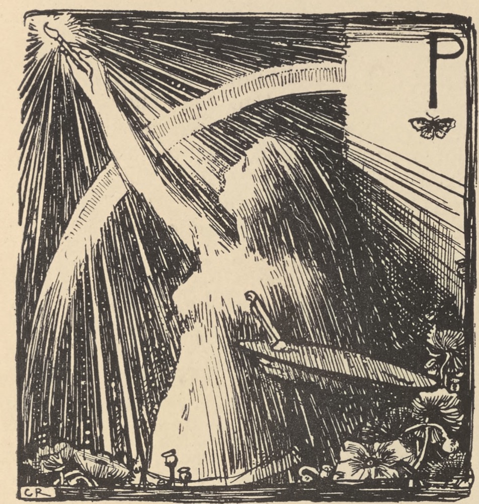
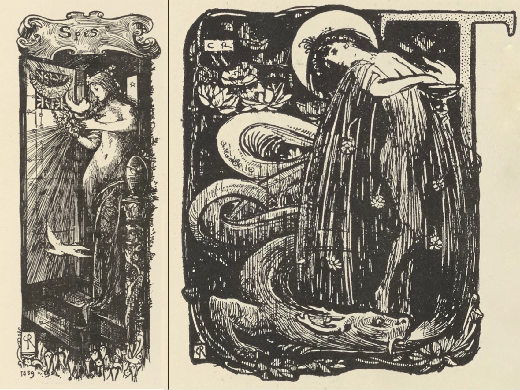
Ricketts’s “The Cup of Happiness” and Gray’s “The Great Worm” weave together some of the key motifs and thematic concerns of the Dial’s first issue. In Ricketts’s fantastic dialogue, the Clown of the Prologue announces that “even an incidental and quite accidental virtue in the story is drawn as an initial” (28). This may be a wry meta-reference to the pictorial letter Ricketts designed to accompany Reginald Savage’s exhibition “Notes.” The initial depicts Spes, the Goddess of Hope, standing in a garden of crocuses similar to those on the front cover, and looking very much like the crowned figure of Fancy who flits in and out of decorations and letterpress alike, along with the ubiquitous worm (fig. 5; see also figs. 1 and 2). In the ensuing dialogue, Ricketts gives speaking parts to the painted scenery and special effects as well as to the main characters on stage, comically exploring the relationship between art and nature. Gray’s “The Great Worm” is a similarly sardonic treatment of the role of the artist in the world. In a parodic reversal of Tennyson’s “Palace of Art,” the story features a worm (dragon) who mistakenly leaves his solitary mountain to participate in the world’s affairs. Keying to the eternal “Warum?” ( Why) sounded in “The Cup of Happiness,” which ends with the recognition that “We are [all] worms!” (33), the titular worm of Gray’s fairy tale dies asking, “Why am I a worm?” (18).
Petra Clark suggests that the issue is thematically concerned with the figure of the artist represented by the eroticised masculinity of Gray’s Great Worm (33). However, the female form of Fantasy is just as dominant, providing a complementary partner to this phallic image. The naked woman and the sinuous worm not only appear together in Gray’s story and Ricketts’s “Cup of Happiness,” but also in numerous textual ornaments (see, for example, figs. 1, 3, 4, 5). One might even say that Fantasy and the Worm appear by design as emblems of the artist’s position away from the fray. Gray’s essay on “Les Goncourts”—that is, Edmond de Goncourt (1822-1896) and Jules de Goncourt (1830-1870), sibling collaborators on numerous French novels, contrasts “the frenetic, nerve-wracked creator and the mob” (Corbett 105), a topic that runs through the Dial and is punctuated by the “Apology.” Even Gray’s essay on these novelists picks up the issue’s theme of decoration and design, noting that writers like the Goncourts can influence the way painters see. The Goncourts, he reminds readers, introduced the art of Japan to France, and with it, “the great value of blank space, and what a large motive the surface itself can be in the decoration of material” (12). Ricketts’s deep appreciation of, and debt to, Japanese art, can be scene in the mountains and sky behind the Great Worm of the frontispiece (fig. 3).
In its numerous blank pages and wide margins, and in its application of decoration to the textual page, the first issue of the Dial aimed at nothing less than changing the way its readers saw art and nature. Within the narrow scope of his chosen art form, the little magazine, Ricketts essayed to emulate the model of Puvis de Chavannes and show, on a smaller scale, “the truth and decorative value of the sky, knitting man to the ground to which he belongs” (2). Reading the issue from the perspective of design, one might even apply this statement to the composition of Ricketts’s frontispiece, which introduces the number and establishes its tone (fig. 3). The volume’s recurring motifs of the Worm and Fantasy remind readers of just this knitting of the celestial and the material, the empty expanse and the decorative instinct. While the reviewer for the Magazine of Art suggested readers would locate the Dial’s “art and literature under the two heads of nudity and nonsense” (“Art in December”), there were a number who, as the Spectator predicted, “admire[d] beauty in execution” (“Current Literature,” 279). Among them was the discerning critic for The Century Guild Hobby Horse, who hailed the Dial for “possessing so much interest and originality” as well as the clear “promise of things to come” (“Contemporary Notes”). By the turn of the twentieth century, “that rare (and now costly) quarto, the first Dial” had become a collector’s item, valued for its artistic design (Marillier 180).
©2019 Lorraine Janzen Kooistra, FRSC, Professor of English, Ryerson University
Works Cited
- Boyiopoulos, Kostas, Yoonjoung Choi, and Matthew Brinton Tildesley, editors. “Introduction,” The Decadent Short Story: An Anthology . Edinburgh University Press, 2014. Ebscohost E-Book.
- “Art in December.” Chronicle of Art. Supplement to The Magazine of Art, December 1889, p. xi.
- Calloway, Steven. Charles Ricketts: Subtle and Fantastic Decorator. Thames and Hudson, 1979.
- Clark, Petra. “Bitextuality, Sexuality, and The Male Aesthete in The Dial: ‘Not Through an Orthodox Channel.” English Literature in Transition, vol. 56, no. 1, 2013, pp. 33-50.
- Corbett, David Peters. “Symbolism in the ‘Little Magazines’: The Dial (1889-1897), The Pageant (1896-97), and The Dome (1897-1900).” The Oxford Critical and Cultural History of Modernist Magazines , edited by Peter Brooker and Andrew Thacker, Oxford University Press, 2009, pp. 101-119.
- “Contemporary Notes.” Rev. of The Dial, vol. 1, 1889. The Century Guild Hobby Horse, vol. 4, 1889, n.p.
- “Current Literature.” Rev. of The Dial, vol. 1. Spectator, 31 August, 1889, pp. 279-80.
- Gray, John. “The Great Worm,” The Dial, vol. 1, 1889, pp. 14-18.
- —. “Les Goncourts.” The Dial, vol. 1, 1889, pp. 9-13.
- Marillier, H.C. “The Vale Press, and the Modern Revival of Printing.” Pall Mall Magazine , October 1900, pp. 179-190.
- Rev. of The Dial, no. 1. Athenaeum, 23 November, 1889, p. 712.
- [Ricketts, Charles]. “Apology.” The Dial, vol. 1, 1889, p. 36.
- Ricketts, Charles. “The Cup of Happiness,” The Dial, vol. 1, 1889, pp. 27-33
- —. “A Glimpse of Heaven,” The Dial, vol. 1, 1889, pp. 19-22.
- —. Oscar Wilde Recollections. Charles Ricketts, Everything for Art: Selected Writings , edited by Nicholas Frankel, Rivendale, 2014, pp. 219-51.
- Savage, Reginald. “The Miracle of the Roses,” The Dial, vol. 1, 1889, AC.
- —. “Notes.” The Dial, vol. 1, 1889, pp. 23-26.
- —. “Illustration to ‘A Glimpse of Heaven.’” The Dial, vol. 1, 1889, AF.
- —. “The Queen of Sheba (after a pastel).” The Dial, vol. 1, 1889, AD.
- —. “Return of the Prodigal.” The Dial, vol. 1, 1889, AB.
- —. “A Simple Story.” The Dial, vol. 1, 1889, pp. 5-8.
- Watry, Maureen. The Vale Press: Charles Ricketts, A Publisher in Earnest. Oak Knoll Press/The British Library, 2004.
MLA citation:
Kooistra, Lorraine Janzen. “Critical Introduction to Volume 1 of The Dial (1889)” The Dial Digital Edition, Yellow Nineties 2.0, edited by Lorraine Janzen Kooistra, Ryerson University Centre for Digital Humanities, 2019, https://1890s.ca/dialv1_critical_introduction/